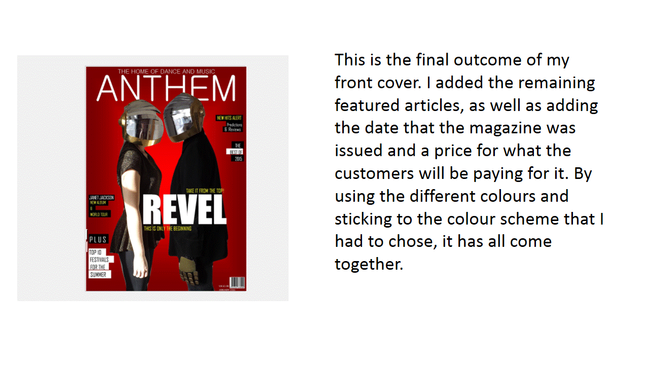
Also, by having a specific genre for the magazine this helped have a target audience and made it easier to attract a particular social group. The design of the magazine and the colour scheme played an important part, because of the fact that it would catch the attention of the targeted audience, and the colours would stand out. By using the colours: Black, White, Yellow and Red, this meant that it would relate to the genre.
Thursday, 25 February 2016
Evaluation: 5.How Did You Attract/Address Your Audience?
To attract my audience, I began with planning how I wanted the magazine to look, as well as decide on the main/featured articles because in my Survey Monkey response, this was one of the most popular responses for reasons why people would purchase the magazine. So this made it an important part of attracting the audience to read the magazine, and addressing their needs.
Evaluation: 2.How Does Your Media Product Represent Particular Social Groups?
My magazines is based on the 'Dance Music' genre and there are many artists that have different looks, and they each have an influence on particular social groups.
These images are some of the most popular artists who fall under the 'Dance Music' genre. Each of them have something unique about them which appeal to social groups, as well as having major influences as well. Many media products represent them to appeal to the audiences who read their magazine.
These photos are of my artists and their clothing. I knew that I didn't want something over the top, and because I was creating them so their faces wouldn't be seen. I decided to match the colour of their outfits to the helmets that they wore through out the photo shoot. Most social groups tend to wear dark clothing as it is the current fashion trend, so by having them dress this way it made them represent particular social groups who wear dark clothing. This would seen as appealing because it is something that they can relate to, just like other artists who each having something that appeal to particular audiences.
To finish the outfit off, I put together a helmet and bought a pair of gloves to represent the artists that I was creating. While this may appeal to particular social groups who enjoy partying, then these would be a perfect example to represent because it would fit in well with the scene which was created. Overall, my media product represents a young social group between the ages 18 and above. This is because of the trends and the partying scene which my outfits and props fit in to, and it also represents those who like the dance music genre.
Evaluation: 1.In What Ways Does Your Product Use, Develop or Challenge Forms and Conventions of Real Media Products?
My product has conventions that use and challenge forms of other products that are exist.
The first way that my product is similar to existing ones is because of the layout. All magazines have similar layouts, but depending on the genre of the magazine some might be different compared to others. For example, NME is based on a different genre, whereas my own is based on the 'Dance Music' genre, which can be seen through how the layout is different. While everything on the NME magazine is colorful and bold, my own magazine has everything much smaller. Also, the mastheads are an example of this because of the fonts, boldness and the colour of them which suggests that each genre has a different take and the conventions may not always be similar.
The main feature stories are usually centered in the middle of the magazines front cover. I followed the conventions of the dance music and did this with my own. By having a bold font which is eye capturing, this is typical and because the main images are there, this also helps create the main feature story so the audience know who they're going to be reading about.
![]() |
| My Own Masthead. Font Used: Gulim |
When it came to finding the right font that would match the genre, I decided to look on the website '1001fonts.com' for inspiration. The image above shows they different types that I thought would be effective to decide on how I wanted my masthead to look. Each of them have a link to the dance music genre, and for me to create my masthead, I decided to use something similar. Because 'Mix-mag' was a big influence on how my final product looked, I decided to use the 'Gulim' font and make it bold, before enlarging it so that it would create a simple but effective look. I didn't want the masthead to be bold, but I wanted it to stand out. This challenged the form of conventions because I decided to do something different, rather than using bold like existing magazines, I decided to keep it simple and by having the font white and large it made it stand out against the red background.
Colour scheme has been an important part of the conventions of magazines. All of them are used on the front cover and sometimes through out the rest of the magazine. For my colour school, I mainly chose bright colours, except for the black which was to make the brighter colours stand out, which many other magazines do as well.
The main feature stories are usually centered in the middle of the magazines front cover. I followed the conventions of the dance music and did this with my own. By having a bold font which is eye capturing, this is typical and because the main images are there, this also helps create the main feature story so the audience know who they're going to be reading about.
The barcode allows the customer to buy the magazines, and without it they wouldn't be able to. The price of my magazines is £2.00, I decided on this price because I thought that it was reasonable and the fit well for the audience that I was aiming the product at.
Monday, 22 February 2016
Subscribe to:
Posts (Atom)