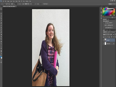
To begin with, I opened up the photo in Photoshop on an International Article. I then expanded the photo so that it would fit the size of the article. I decided to use this photo because of the lighting and the background is plain, so if I was to cut anything out, I would have a problem with the different textures.
Next, I decided to add the Mass Head, I used the font 'Trajan Pro', the same as the magazine cover I created for as an introduction to Photoshop. I changed the size of the font to '72' because it fits across the top of the image and makes the font look more bold, the colour also helps make it look bold.
I then went on to start adding featured articles. I decided to change the colour of the font to blue, because there was hints of it in the photo and I wanted to created a them which linked to the photo. I thought of different types of feature stories that would seem interesting, and I decided on stories that you would expect to see in a college magazine.
Then, I added the main feature story which is 'Success Stories'. I chose to have this as the main story because I think that it is good to see how people have succeeded once leaving college. Also, I changed the colour of the title to purple and made the brightness of the photo a lot brighter as I thought that it was too dark.
After I made the changes, I then went onto adding plug, which would mean that tickets could be won to upcoming events. I thought this would be a good idea to use, because young people like concerts and festivals, and this would appeal to them. Also, I added a barcode and social media logos which is something you would expect to see on a magazine cover.
To finish the cover, I added the main feature story, and made the font bold to emphasize that this is the main story of the magazine. Because the colour is red, which is also very bright this makes it stand out much more. Also, I added an issue number and the date to let the students know when it was published and what number of the copy it is.
When it came to creating the contents page, I had a few ideas of how I pictured it. I knew that I wanted the images to one side so that the page list would be at the right side and that way nothing would overlap, and it wouldn't look too crowded. I opened up a new International Article and added one of the cover photos that I had taken. I then opened up text and began to use the colour red, same font and made it the same size so that it would be at the top of the page.
Next, I then began to add the page list. I used the same colour as the Mast head because it related to the theme of the cover. Then I carried on and began to write the feature story title of what was going to be inside the magazine. I know that in magazines they have adverts so the page numbers are spaced out because of them.
To finish it off, I then added a second photo like I had in my draft version of the content page. Even though I didn't add a third image, I think that it looks good with out it because there is everything that you would expect to see on a content page.


No comments:
Post a Comment