Thursday, 1 October 2015
Colour Scheme Ideas, Name Ideas and Feature Story Ideas
These are the ideas that I came up with when deciding on what to call my magazine. I thought about the dance genre and some of the connotations that are linked with it and these are what I came up with. I used inspiration from around me, such as music videos and music magazines which also helped. 'The Spin' came from the idea of DJ's spinning records, but I also realised that DJ's weren't just part of the dance music genre. 'Anthem' came from the idea of music fans all having a song which they believe is their Anthem and also their artists as well. Originally I was going to call my magazine 'Neon', but I decided not to because I thought that it was too simple and wouldn't be an effective magazine name and some of the fonts didn't go to well with it.
Cover Stories that would appeal to the target audience are:
These cover stories would appeal to a target audience because these are what would typically be on the front cover of the magazine and on the contents page. The main cover stories would be about the Artists that would be featured in the magazine and what it is that their story is. Also, concerts and events are also effective cover stories because many readers will find it interesting, especially if they are interested in attending concerts and events . Competition are also what appeal to the target audience. Because many people enjoy entering competitions, this would be more suitable to have on the magazine as they are more likely to enter them and many of those who entered will end up winning something in return, depending on what is being given away and how many there is available.
The colour schemes that I have decided on, are based on the colours that are used in the dance music genre, which are a range of bright colours that will stand out. The colours that I thought would be effective would be:
I used the website https://color.adobe.com/ to help me look at the different shades of these colours as I believed this would give me an idea of what colours that I wanted to use.
These were the outcomes that I got, these different shades are all different from one another, some lighter than others which helped me see which shade would be best to use on the magazine cover. I think that the electric blue could work best because it is eye capturing and the readers would immediately be drawn to it. Also, the pink and yellow would also be effective because they both work well together as they appear more in the dance music genre compared to other colours. Overall, the colour scheme that I'm going to use is
|
Mise-en scence Location and Prop Ideas
 |
| Concert |
 |
| Busy Streets |
Props: The props that I used for this photo shoot were a helmet and gloves. I decided to use these because I knew that these linked well with the dance music genre. To make the helmet, it involved using prints which were cut out and glued together in order to begin to create the shape of the head and eventually altogether create the helmet. For the gloves, I bought a pair and then stuck down the cut out pieces to create the gloves. These are important to appeal to an audience because not knowing the real identity of the artist would allow them to be intrigued and want to know who it is that is creating the music that they like.
Costume Desgins
This is the first outfit that I chose to put together. I decided that by having the artist wear black, it would be something simple and would still stand out with the prop that I used to create the rest of the outfit. Because it is a plain outfit, this would appeal to the target audience because in the dance music genre, some clothing tends to be rather simple and the props are what make it eye catching.
This is the second outfit. I wanted the artist to be wearing something bright, and the pink skirt worked well for this as it is eye catching and the colour is automatically associated with dance music as it features lots of bright colours. I chose the top because it is glittery and that is also eye catching because the light bounces off it really well. For a target audience, this would appeal to them because it would be something that they would expect to see.
This is the third and final outfit. I chose a top similar to the second outfit, but the colour was black and gold which worked well because the prop that was used was similar to it, and included the colour silver as well. This would appeal to a audience of this genre because gold and black these colours are often used in music videos or for the genre.
Social Class & Demographic of My Product
The price of my magazine is going to be £2.00. I decided on this price because I thought that it was a reasonable price and it is something that the readers are able to afford, because it's not too expensive compared to other magazines which can cost more, but that maybe because of their audience and their social class. In the magazine, the free gifts that would be included would be vouchers for iTunes. I decided in vouchers because of the fact that the audience are more likely to use them and can buy anything with them. If a CD was to be included then this may not be as popular because not many people listen to CD's, music is mainly streamed from online which is becoming more popular.
The Social Class table helps me with my feature stories and the target audience which my magazine is aimed at . Out of all the social classes, Working Class and above would help me with my feature stories, depending on the artist as they ware more likely to attend concerts and festivals, compared to those who depend on the welfare state for their income. However, the target audience would be everyone |
Style/Iconography of My Product
Reader Profile Research
Demographic Information:hard data, not questionable. Age, Gender, Income, Location. Uses the table above. Magazines says '65% of their audience A. B, C1' -
D- someone who cleans, work on a building site.
C2- work on a building site: brick layers, plumbers.
c1- people who work in admin,
B- Nurses, social workers, teachers, police officers. Making decisions independently.
A- Civil engineers, doctor, lawyer. These people have disposable income.
Psychographic Information: what genre of music do you like?
What bands or artists do you like?
How much money do you spend on music concerts per year?
what's your favorite Brand? -Apple, Converse, associate with a particular music genre.
How do you consume music? Download, Stream, Radio, CD/Vinyl.
How often/hours per week do you listen to music?
What devices do you use to listen to music? Computer/Laptop, phone, radio, CD
What is a reader profile?
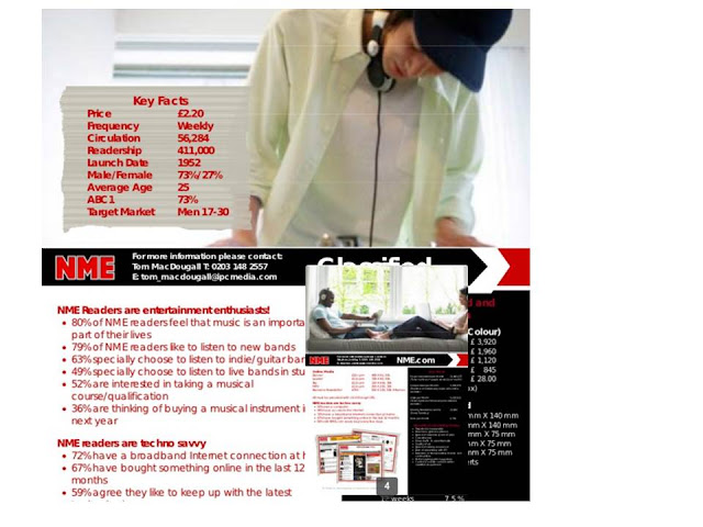
A reader profile is information that has been collected by magazines who are able to use this information to find out how their magazine has an impact on the readers. It also includes information about their interests, their income, what their gender and age is. All this information helps them know what the readers similarities and differences are.
 |
NME attracts both genders, however the male percentage is much higher than the female which shows that the target audience is mainly males, rather than females. The average age of the reader is 25, and the social class is anyone from working class and up to upper middle class, this is based upon the amount that they spend at concerts or attending festivals. What make the NME audience want it, is because it is something that they can all relate to as they all have the same interests when it comes to reading the magazine.
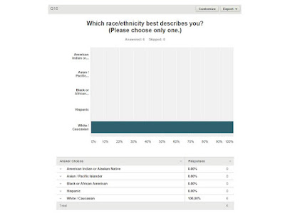
The reader will want to read a magazine that they find interesting, because it has some of their interests in it as well. Also, they may expect competitions inside to win free tickets to a concert/festival because in the media pack it shows that 67% will be attending a festival this year, and this would make the magazine more desirable knowing that the audience would have to buy the magazine or enter online.The purpose of a Reader Profile is to understand what the audience is interested and get to know them so that it becomes much easy to to know that they will read the magazine, whether or not they buy it or read it online. A reader profile will help me sell my product, because I have gathered information through a questionnaire which the readers will have answered, so that I know what audience I will be targeting and what to put in the magazine to make the audience want to read it.
Subscribe to:
Comments (Atom)


