Music Brief: To design a front cover, contents and double spread of a new music magazine. All images and text used must be original, a minimum of four images must be used.
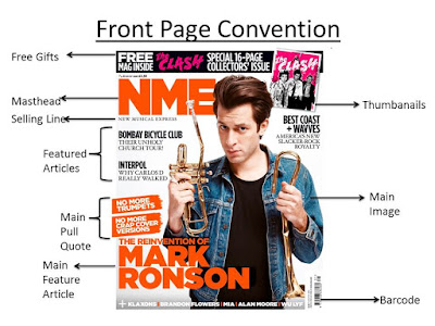
- Masthead- The masthead is very bold and stands out, due to the colour of it being orange and the size and font. This makes it effective, because it is a dominating icon which makes it clear what the title of the magazine is. Also, because it is a short masthead, it will also be very easy for the audience to remember.
- Selling Line- This used to say what type of genre the magazine is, so the audience know what it is that they're expecting to read when purchasing the magazine.
- Featured Articles- On the left hand side of the magazine, it shows some of the featured articles that are inside. The way that this is written is very short and straight to the point, but also the sub-titles are worded so that the audience will be interested in reading about the remaining articles. By having effective sub-titles and featured articles, it makes the magazine appeal to the audience.
- Main Pull Quote- The main pull quote is used to show features from the interview. Because Mark Ronson is on the front cover, and the main article being about him, the have used some keys words to say how he has changed. And this can be seen in the main image, showing that the main pull quote relates to the image. Also, the colour of the font is white, which is standing out against the orange background behind it, which is also the same colour as the main article font.
- Main Feature Article- This is what the reader will be reading about. The main article stands out from the rest of the featured articles, because the size of the font is much bigger compared to the rest on the front cover and the colour is orange, which stands out against the white backdrop. Also, it says 'The Reinvention Of', just by seeing that will automatically make the magazine look interesting because on magazines you wouldn't expect to see words like that used.
- Main Image- The main image of the this photo is a medium close up. Because the image has been taken this way, it allows more articles featured articles and plugs to be added onto the front cover. What I like about the image, is that he is holding a broken trumpet in both of his hands. I find this very effective because is links to the main pull quote which says 'No More Trumpets'. Also, because it has been taken against a white backdrop, Mark stands out more despite him not wearing bright clothing, he still stands out because of the use of the lighting as well.
- Barcode- It shows the price and release date of the magazine, so the audience knows whether or not it is the newest addition and the price has gone up or down.
Institution: NME stands for New Musical Express. It is a British music journalism magazine which was first published in March 1952. The founder of the magazine is Theodore Ingham. The price of the magazine is £2.20 and is published weekly. NME readers feel that music is the most important part of their lives and that they like to listen to new bands. Some of the readers don't always buy a magazine, but instead read it online by subscribing. This shows that technology has a big advantage of how many copies that NME sells, From most of the information, it appears that the readers are interested in technology. they have access to the internet and own a computer.
Ideology: The ideology behind NME is that it is a Indie/Rock Magazine that has a target audience between the age of '17-30', which shows there is a large age group.Also, the front cover shows that NME mainly focus on artists who are making a comeback. For example, Mark Ronson is on the front cover and it clearly states that he is 'Reinventing' himself.
Audience:The average age of readers is 25, which suggests that it is mainly targeted at young adults who are in their late 20's. It is also mainly focused on men, between the age of 17-30. From the percentages shown 73% of men read the magazine, whereas only 27% of women read the magazine. This shows the magazine is mainly aimed at men, more than women.
Representation: The representation of the magazine is the way that the artists are portrayed on the front cover. On other NME magazine covers, they're all different from one another. This could be because of the style that the artists portray themselves as, or being stereotypical. On the front cover, there is lots of featured articles making it look full, which maybe how NME want the design of their magazine. There is a use of bright colours which suggests that it isn't going for a dark theme, but instead a light coloured theme and this could mean that. It is clear that the magazine chooses a colour scheme based upon the way that the fans would expect to see them.
Information found: http://www.slideshare.net/zlorhenley/nme-media-informationfull-2011

No comments:
Post a Comment